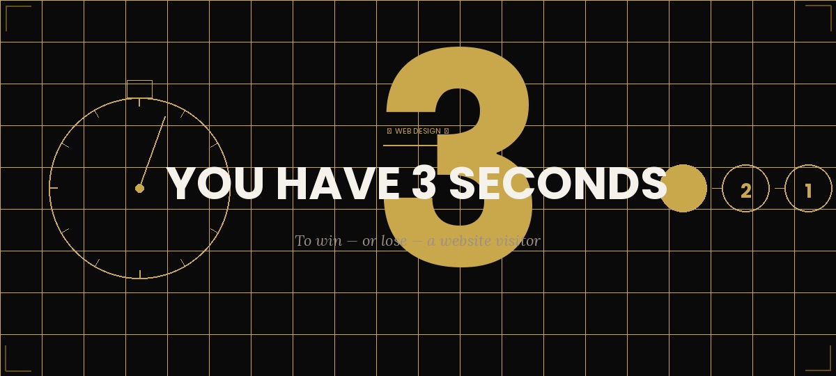
You spent weeks building your website. You agonized over the copy. You chose your colors carefully. And in the three seconds after a visitor lands on your homepage, they decide whether any of that work was worth reading — or whether they should hit the back button and try your competitor instead.
Three seconds. Studies consistently show that's the window you have to make a first impression strong enough to earn the next click. So what needs to happen in that window?
The Three Questions Every Homepage Must Answer Instantly
When someone lands on your website for the first time, their brain is scanning for answers to three questions simultaneously. If your homepage doesn't answer all three within the first few seconds, you've lost them.
- What is this? — What does this company do? What do they sell? Who are they?
- Is this for me? — Am I the right audience? Does this solve my specific problem?
- Can I trust this? — Does this look professional? Does this feel legitimate?
Most homepages fail on question one. They lead with a clever tagline that sounds great internally but communicates nothing to a first-time visitor. "Empowering your future" or "Where innovation meets excellence" tells the visitor nothing concrete about what you actually do.
Clarity always beats cleverness. A homepage that tells visitors exactly what you do in plain English will outperform a beautifully written but vague one every single time.
VS Media Team
What the Research Actually Says
The Nielsen Norman Group — the most rigorous UX research organization in the world — found that users form an opinion about a website in approximately 50 milliseconds. A follow-up study found that the design quality (not the content) drives that initial snap judgment. If the design looks untrustworthy, users don't read far enough to discover whether the content is good.
This means your website's visual design isn't decoration. It's the first credibility signal your brand sends, and it arrives before any word is read.
75% of consumers admit to making judgments about a company's credibility based on their website design. Your website isn't just a marketing tool — it's a trust-building tool that works (or doesn't work) before a single word is read.
The Five Elements That Win the 3-Second Window
- A clear headline that states exactly what you do and who you do it for — no jargon, no taglines, no cleverness at the expense of clarity
- A strong visual hierarchy that guides the eye from headline to supporting copy to the primary call to action without the visitor having to think about where to look
- Professional design that signals quality and legitimacy — inconsistent fonts, mismatched colors, and low-resolution images all trigger subconscious distrust
- A single, obvious call to action — not five options, not a navigation menu that demands a decision — one clear next step
- Fast load time — Google's research shows that 53% of mobile users abandon a site that takes more than three seconds to load. Speed is design.
What to Do Right Now
Open your homepage and set a timer for three seconds. What does a first-time visitor learn in that window? If the answer is unclear, confusing, or generic, that's where your conversion problem starts — and it's exactly where to focus your next website improvement.
VS Media designs websites that win the three-second window and convert visitors into customers. Let's talk about your site.