Every creative project we take on at VS Media starts the same way: with a mood board. Not a brief, not a strategy document, not a color palette — a mood board. It's the single most powerful tool in our creative process, and it's one of the most underused tools in brand building.
Here's why we build them and exactly how they work.
What a Mood Board Actually Is
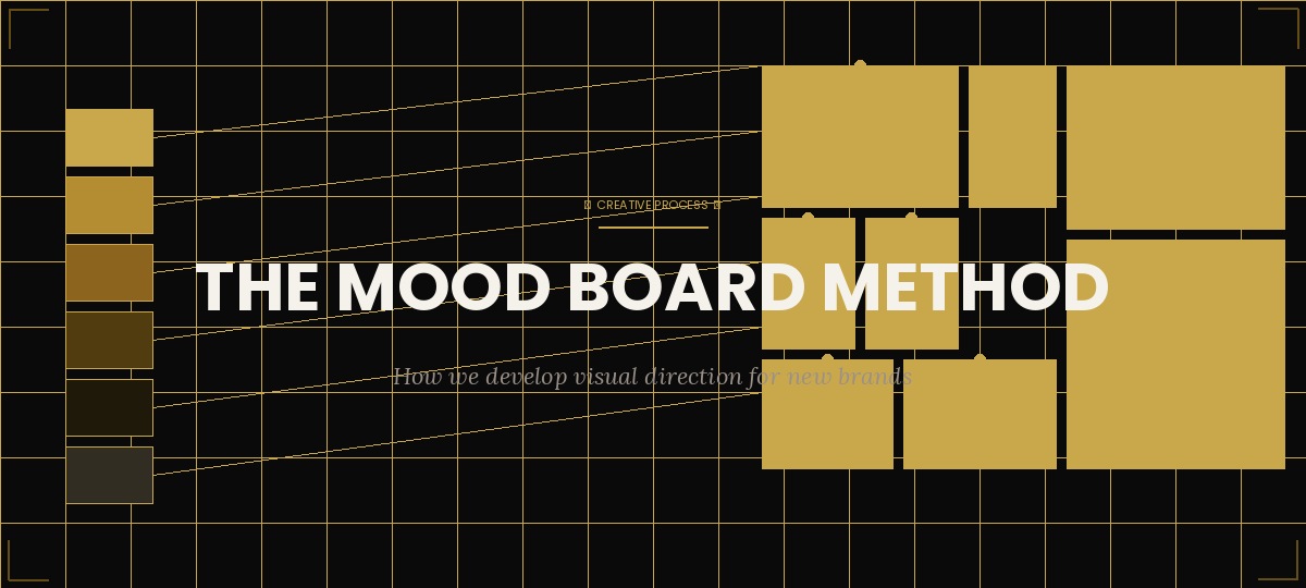
A mood board is a curated collection of visual references — photographs, illustrations, typography samples, color swatches, textures, and design examples — assembled to define the emotional and aesthetic direction of a creative project before any original work is created.
It's not a collection of things you want to copy. It's a vocabulary. It gives the creative team and the client a shared language for describing what the finished work should feel like.
Why It Comes Before Everything Else
Creative misalignment is the most expensive mistake in brand design. It happens when a designer interprets a brief differently than the client imagined it, produces work based on that interpretation, presents it to the client, and then spends three rounds of revisions trying to close the gap between what was made and what was wanted.
A mood board prevents this entirely. It surfaces misalignment at the cheapest possible moment — before any original work has been created. A five-minute conversation about a mood board can save days of revision cycles.
The mood board isn't a deliverable. It's a conversation. The version that gets approved isn't the end of the process — it's the beginning of the real work.
VS Media Creative Team
How We Build Ours
Our mood board process has four stages:
- Discovery — We start by asking the client to describe their brand in five adjectives. Not the product — the brand. How should it feel? Authoritative and minimal? Warm and approachable? Bold and disruptive? These adjectives become the filtering criteria for everything we collect.
- Collection — We gather 40 to 60 reference images from a wide range of sources — photography, illustration, packaging, editorial design, architecture, nature. We're looking for images that evoke the adjectives the client described, not images of competitive brands or direct references.
- Curation — We narrow the collection to 12 to 16 images that tell a coherent visual story. Each image earns its place by contributing something specific: a color relationship, a typographic mood, a texture, a compositional energy.
- Presentation and alignment — We present the mood board to the client with a short explanation of why each image was included and what it contributes. Then we listen. The client's reaction — particularly what makes them uncomfortable — is as valuable as their enthusiasm.
Before your next brand project, ask your team to each independently collect 10 images that represent how the brand should feel. Compare them. The overlap tells you what's already aligned. The gaps tell you where you need to have a conversation before anyone starts designing.
From Mood Board to Visual System
Once the mood board is approved, it becomes the reference point for every creative decision that follows. Color palette choices are evaluated against it. Typography selections are tested against it. Photography direction is built from it. It keeps the work coherent across every touchpoint, even when different team members are working on different elements.
The best mood boards are ones you can still refer to six months into a project and find them relevant. If the work has drifted from the mood board, you'll feel it — and you'll know exactly where to go to recalibrate.
Want to see the mood board process in action on your brand? Let's start a conversation.